In this lab, we'll create a carousel. Carousels are popular design elements that can be used in a variety of ways
This excersize will demonstrate using a carousel as a slide show
OK!
CSCI 1720
Intermediate Web
BS III - Bootstrap Carousel
On your external drive, inside your userid.csci1720.net/labs folder, make a new folder named bs-3
Download bs-3_starter_files.zip to your bs-3 folder and extract the files. I made a few little changes to the navbar, the template, and the bootstrap.html page, so your final product won’t look exactly like last lab’s work
Open the bs-3 folder in Brackets. Open template.html
Save template.html as carousel.html
Create the Carousel
Change the document’s title to Bootstrap Carousel and update the <head> element’s meta information
Last lab, we created our navbar with the template file, so that’s taken care of. Add the active class to the navbar's 'Carousel' link
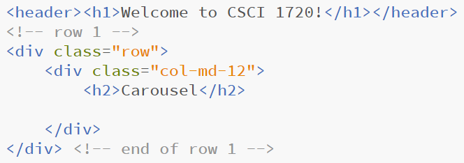
Change the first column’s class to col-md-12 and delete the second column
Immediately inside the column, add a heading 2 that says ‘Carousel.’ Take out the empty paragraph:
Fig 1- Beginnings...
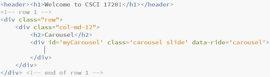
Our carousel is going to consist of two nested divs - one for the indicators and one for the slides themselves
The first, outer <div> (after the heading 2) has to have an id, classes class='carousel slide', and a data-ride='carousel' attribute (which tells Bootstrap to begin animating the carousel immediately when the page loads)
Fig 2- Carousel Outer
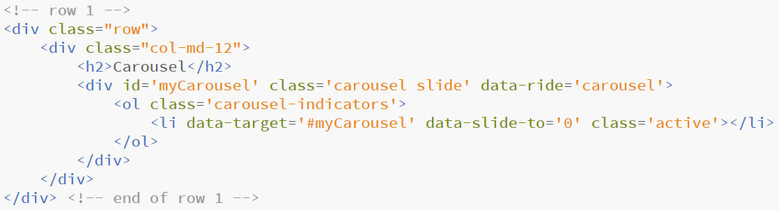
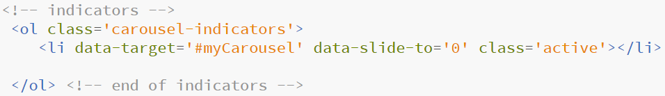
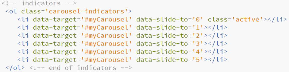
Now we need to add the indicators, the little lines that show which picture we’re seeing. Enter
Fig 3- Adding Indicators
Place the cursor on the list item line and press Ctrl+d. Replace the “0” with 1 on the second list item and delete the class='active' part. Then, with the cursor on the second list item, press Ctrl+d four more times and replace the “1” with 2, 3, 4, & 5
Fig 4- Duplicating LinesFig 4a- Duplicating Lines
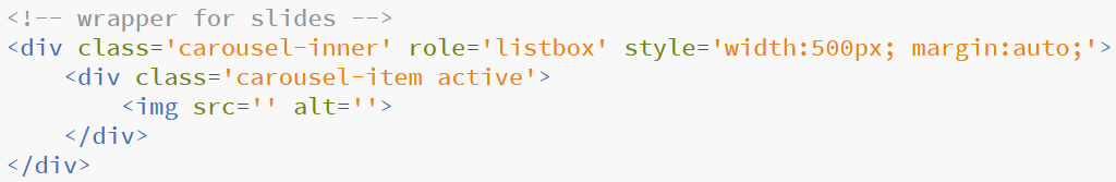
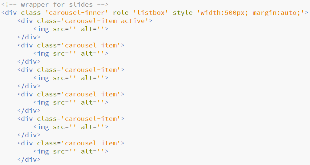
That takes care of the indicators. Now for the inner <div> (which, in turn has nested <div>s – holding the images - nested within it). Note that the <div> under the comment appears below the </ol>
Fig 5- Inner div
Attributes, explained
- carousel-inner is self-explanatory
- role=”listbox” is used for accessibility purposes. It identifies to a screen-reader or other assistive technology device that this is an element that allows a user to choose one or more options, such as images in a carousel
- The inline styling sets the div’s width to 500px (which is the width of the images) and centers it in the column
- The inner div is the first image
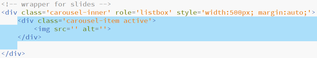
Highlight the first image div (you may have to tab in on the blank line, but it’s important to highlight up to that point
Fig 6- Duplicating divs
Again, what we're doing here is saving a little work by duplicating the typing that is common to all of the following <div> elements
Press Ctrl+d once
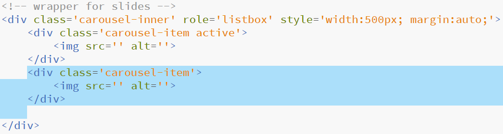
Delete the 'active' class from the second <div>. Highlight it as shown above, and press Ctrl+d four more times
Fig 7- Setting up the slide divsFig 7a- Setting up the slide divs
You may want to delete the blank line between the </ol> and the </div> elements
That completes the structure of the carousel
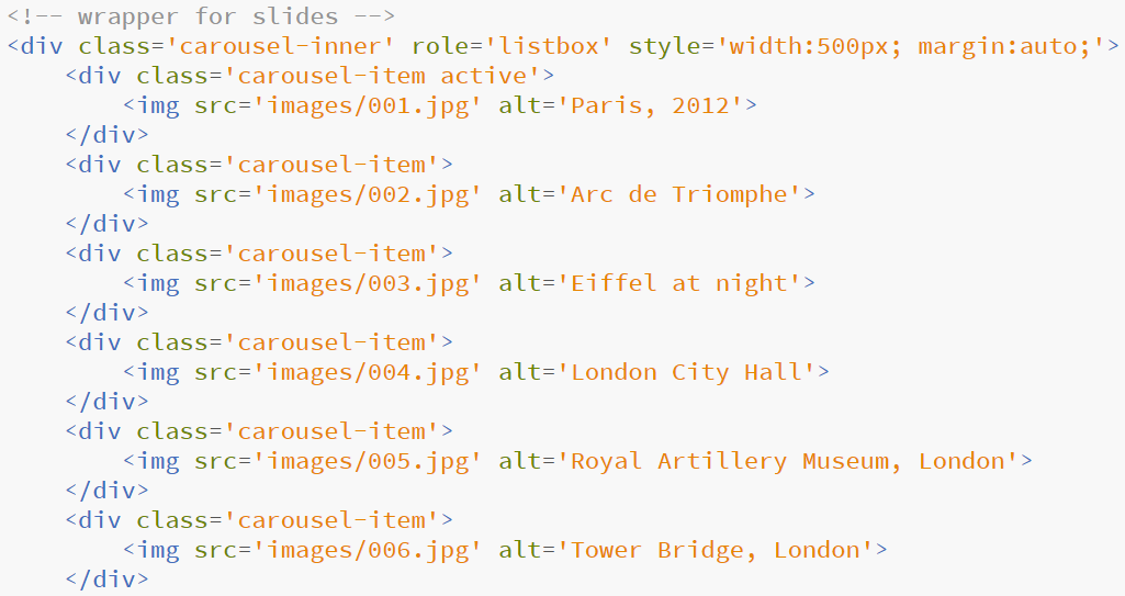
Now all you have to do is enter the src and alt information for each image. The filenames are 001.jpg, 002.jpg, and so on; the alt text should be:
Fig 8- Slides' Information
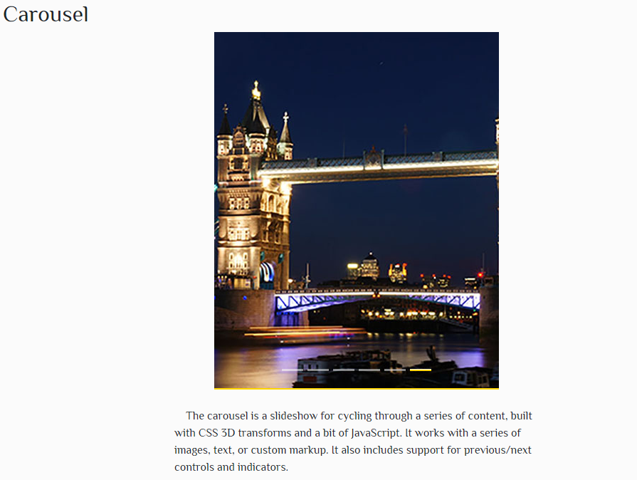
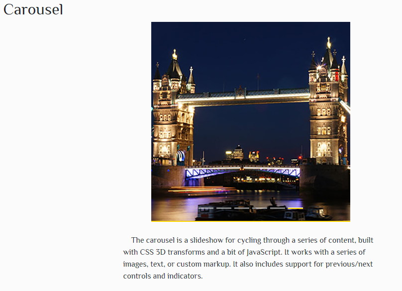
Beneath the carousel code, enter a paragraph with the following text:
The carousel is a slideshow for cycling through a
series of content, built with CSS 3D transforms
and a bit of JavaScript. It works with a series of
images, text, or custom markup. It also includes
support for previous/next controls and indicators.
Add some inline CSS to the opening paragraph tag to set its width to 50% and margin to 2em auto
Save your work and display it in a browser (Live Preview)
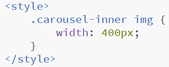
I'm not in love with the current state of affairs. The images are a little too big. So let's customize our carousel. Change the style attribute in the carousel-inner div to make the width 400px instead of 500px
Fig 10- Customizing the carousel
Check the results in the browser
Fig 11- Modified carousel width
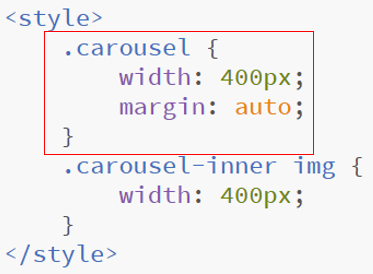
Uh oh! Now the images are getting cropped! How do we fix this? Remember, I mentioned earlier that all of the image files are 500px wide. So the image is 500px wide, but is being displayed in a container that's 400px wide. Let's customize our CSS a little.
In the <head> element, add a nested <style> element. The style element can be placed anywhere, but I usually put it right above the </head> tag. Add a new rule, using the space combinator:
Fig 12- Modifying embedded CSS
This is telling the browser that all images that are nested inside a <div> whose class is carousel-inner will display 400px wide instead of their actual width (500px)
Refresh the page in the browser and check out the results
Fig 13- That's better
One last thing that's annoying me. With your page displayed in the browser, move the mouse to the bottom of the display. Watch the carousel for a little while. It's working as it should. Now, move the cursor up to the whitespace on either side of the carousel image. Wait for it...
The problem here is that we didn't set a width for the carousel. So, by default, it's displaying 100% wide in its container. The scrolling stops when the mouse cursor hovers over it. So let's tweak the <style> element a little more
Fig 14- Constraining the Carousel's width
Take another look at the page. Now everything's looking good (The 400px vs. 500px issue is a lot more obvious on smaller displays. Changing it makes everything a little more mobile-friendly)
Now, if the user hovers the mouse cursor anywhere but the displayed image, the slide show will roll on
Uploads and Such
Save all of your work. Log in to your csci1720.net account (userid.csci1720.net) using FileZilla (host: csci1720.net; userid: etsuid; password: *********)
Double-click on your labs folder
Right-click in the whitespace in the lower-right pane and select ‘Create new directory and enter it’
Name your new directory bs-3
From left to right, copy your files and folders to your /labs/bs-3 directory
Right-click on carousel.html (on the right side). Click ‘Copy URL(s) to clipboard’
Return to your browser and open a new tab
Paste the URL into the address bar
Delete the ftp:// part and change the @ to a dot (.)
Hit ‘Enter’. Admire your work
Now, return to Brackets
Copy the URL of your carousel.html file to a new text file in Brackets. Save the file as bs-3.txt and upload it to the D2L BS-3 folder